Trends ebb and flow, which can make predicting what will be on-trend from year-to-year difficult to pinpoint. While trends emerge from the collective unconscious, your aim as a non-profit is to stay current, so your organization reflects a with-it image. This means that the calendar year is a great time to check-in with your conference aesthetic for the upcoming year. As we head into 2025, our estimations of trend trajectories can help design ahead of the curve or simply give insight on what people may gravitate towards.
Our team has developed hundreds the visual aesthetics to be implemented through graphics designs for hundreds of successful conferences. We tailor each conference to reach organization’s personality and mission while adopting graphic design trends to give the event a true ‘wow factor.’ The following graphic design trends reflect how modern design is becoming more adaptable, human-centered, and innovative.
What Visual Aesthetic Trends Do We Predict for 2025?
How can your organization stay current in 2025? Most of the trends we have predicted align with design best practices with some modern flair. Remember to stay true to your non-profit’s overall visual identity while adopting and adapting the trends that make most sense to your brand.
1. Liquid Modernity: Designing for Continual Change
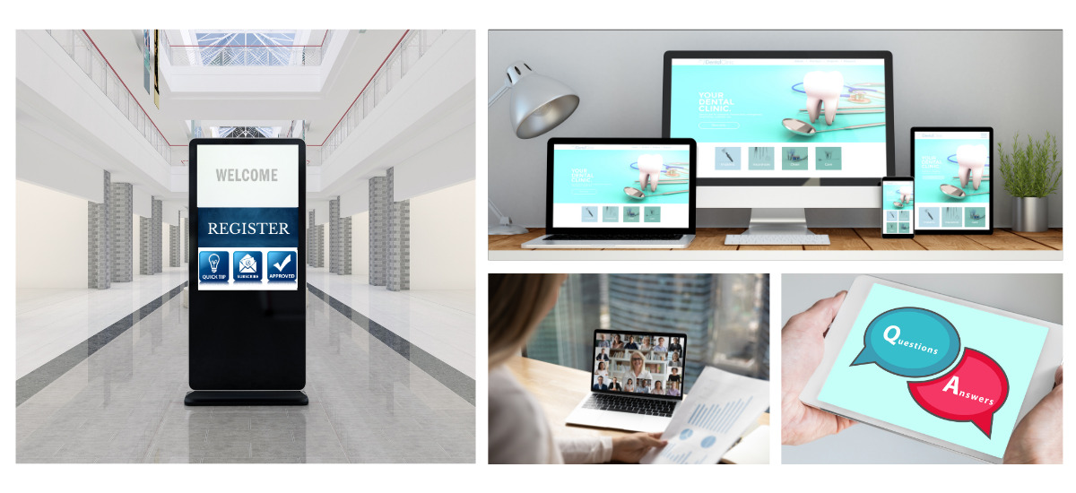
Leaning into the concept of change being the sole constant in our world, “Liquid Modernity” is a design trend that mirrors the fluidity of time. This design philosophy embraces modern evolution and the concept of newness following trends with an adaptable mindset. Expect to see dynamic layouts, responsive elements, and designs that evolve over time to stay ahead of the curve.
How to implement this into your next conference:
While COVID-19’s effect has passed, virtual conference options are an accessible and adaptable way to tailor your event to your attendees. Integrate Liquid Modernity into your conference with an app with:
- A message board for attendees to connect virtually
- Q&A option for keynote speakers
- A virtual meet-ups for those unable to attend in person
Additionally, audiences now expect content to be customized to their interests. Be sure to use opt-in and opt-out features for all communications, and segment your audiences based on interest.
2. Halfway Colors & Glitter: Designing in the Multiverse
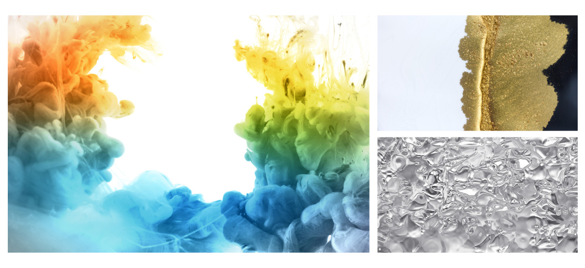
As AI becomes increasingly integrated into daily life, we find ourselves living in a “multiverse” of realities. One of the ways this concept is reflected is in the rise of halfway colors and glitter, which combine bold and ethereal elements.
Halfway colors are found when hues flow together and can give dimension to pattern making. This can help create the feeling of a sort of bridge between reality, and the reality within screens that we find ourselves immersed in today.
Glitter brings joy. The idea of glitter being top of mind comes back to nature. Water, when sunlight reflects off it, has been proven to boost wellbeing in humans. A reflection of this craving is a shifting to blues, blueish greens, darker tones, with white accents creating the “glitter” effect. The juxtaposition of colors from different universes seeks to connect these diverse worlds, often through shimmering patterns and unexpected contrasts which we will be seeing a lot of into 2025.
How to implement this into your next conference:
Pull in reflective elements into your conference branding. Metallics and glitter accents will set your conference graphic design apart from others. Consider metallic foils on some of your signage or create a glitter sticker as part of your swag bag.
3. Minimalist Maximalism: The Best of Both Worlds
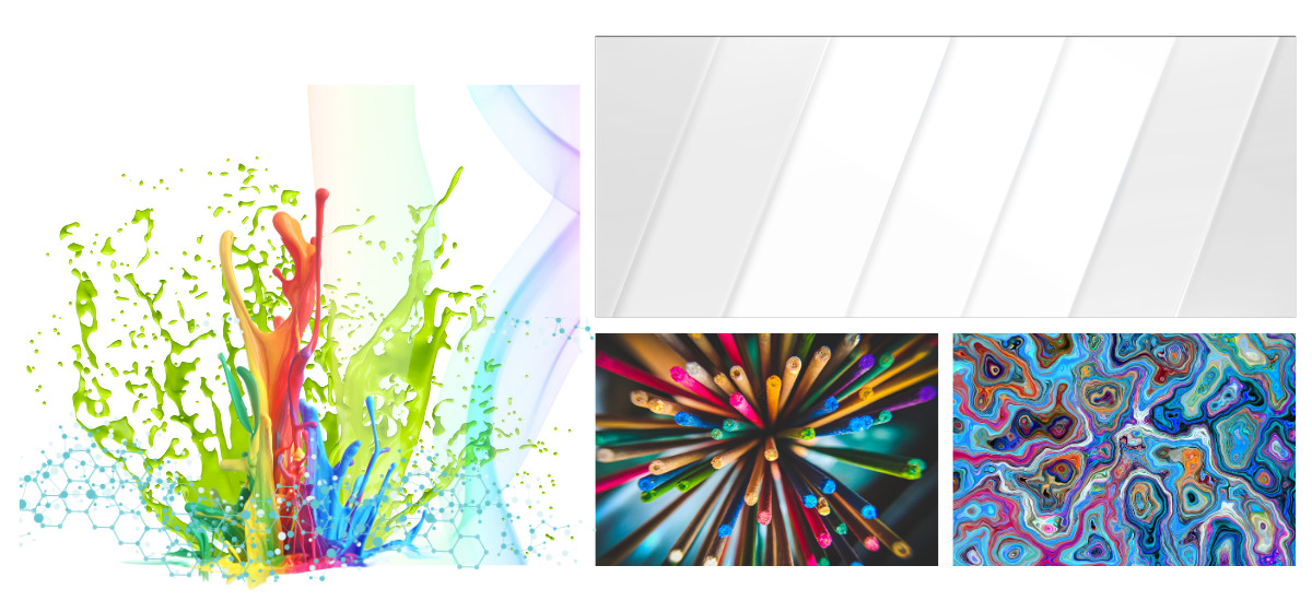
The minimalism and maximalism trends finally begin to meet. In 2025, the two are converging into a hybrid trend that combines clean, white space with bold, maximalist accents. Simplicity with a focused flare on texture, color, and typography. This trend uses the power of bold contrast to create elegant, yet visually rich designs.
How to implement this into your next conference:
When designing your conference’s foundational elements, consider laying patterns, using bold shapes, and unique fonts. The key to this graphic design trend is to balance these bold elements with plenty of room for them to ‘breathe.’ This means don’t skimp on the white space. Think of your designs needing to be 35% maximalist and 65% minimalist—the nature of the maximalist design results in the 35% feeling more like 50%, and therefore, balanced.
4. What colors will be popular in 2025: A New Palette
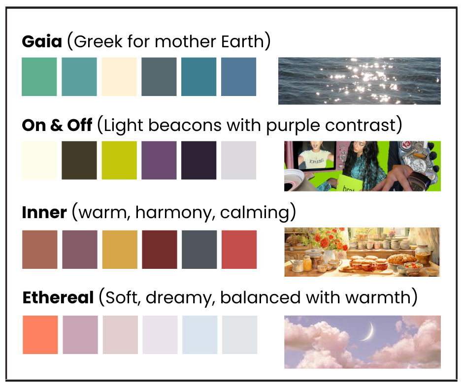
The color palettes are changing in 2025! We are shifting into some new color directions for the first time in a while as people begin to crave more comforting cool tones, cozier low-stimulating hues, and high contrast against dark tones. This shift began mid-2024 and will continue to morph through 2026. Here’s a glimpse into the color palettes that have already begun to dominate:
- Gaia: Greek for Mother Earth. Moving away from yellow-green hues, we’re seeing bold, dark colors with whiteness similarities in hues. Earth tones with a focus on blue/greens.
- On & Off: High-contrast beams of neon accent against dark purple tones, creating an electric, futuristic feel.
- Inner: Warm, low-stimulation colors inspired by the human body. Expect to see comforting tones that evoke a cozy, nostalgic feeling reminiscent of the “Grand-Millennial” trend or “Grandma Core”.
- Ethereal: Soft, dreamy tones with hints of silver and imperfect washes. The ethereal trend combines a cloudlike aesthetic with multiverse inspiration,
How to implement this into your next conference:
Implement one of these color pallets or make them your own. Choose a color scheme that resonates with your organization’s mission, as well as your conference theme and location.
5. Scrolling & Cursors: Dimension in Web Design
Parallax scrolling and custom cursors are hitting the web design scene, creating a sense of depth and motion. By making the user’s experience more interactive, this trend turns websites into immersive environments. Scrolling will no longer be passive; instead, it will feel like a journey that draws the viewer deeper into the content.
How to implement this into your next conference:
As marketing design experts, we know the power of visual elements, and with the ubiquity of the digital world, elements like cursors trigger action in an audience. Consider placing interactive monitors and screens throughout your conference space.
Using a parallax effect on your conference website adds a dynamic feeling to the user’s experience and encourages to dive deeper into your content. To implement this, choose images that are portrait-oriented and use them in square or landscape frames with the parallax effect.
6. Customization with AI: Imperfection is the New Perfection
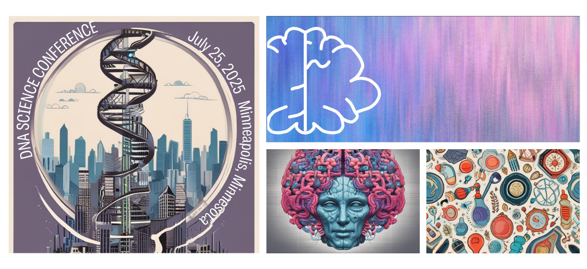
As AI democratizes the world of graphic design, there’s a growing desire to see the “human touch” in digital creations, romanticizing imperfections. With the help of AI, everyone can now design, making the customizations on Ai-created content critical to maintain the quirks of the human touch. Retrofitting AI content into designs new and old will continue to be seen more and more. However, audiences want to be reassured that a person took time and consideration to put a personal touch on the design they’re enjoying.
How to implement this into your next conference:
Don’t shy away from using AI as a graphic design tool. Just keep in mind that AI should never be the driving force behind the creative. When designing the primary elements of your conference branding, put in elements that let the viewer know that a person put thought and care into some additions.
7. Screen Consideration: Mobile-First & Dark Mode
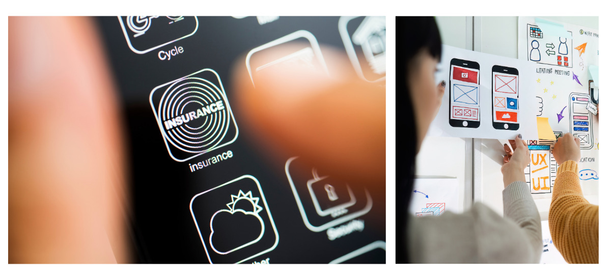
Mobile-first design and dark mode have been trends for decades, but they’re going to become even more crucial in 2025. With more users accessing content via mobile, design will increasingly prioritize mobile optimization and responsive design. Dark mode, which reduces eye strain, will continue to gain popularity, seeing a continued development of light and dark mode offerings.
How to implement this into your next conference:
Always verify that your designs will translate to a mobile screen. To avoid the most common non-mobile-friendly mistakes in your graphic design, be sure to:
- Do not embed text in your website graphics. When text is embedded within an image it will not resize for mobile viewers. However, if text is its own web element, the viewer’s browser will automatically scale (“respond”) it to fit the screen. We see this mistake most often in conference banners.
- Compress your images before adding them to your website. Mobile users often have mroe limited bandwidth. Optimized images load quicker, making for a more seamless experience.
- Design for touch screens. Include button designs in your graphic design library. Using button instead of hyperlinks is more user-friendly since they give the user a larger target.
- Emphasize legibility. Mobile screens are just a fraction of a monitor’s size. This means that graphic design elements should be immediately recognizable and able to scale.
8. Accessibly Sustainable: Designing with Purpose
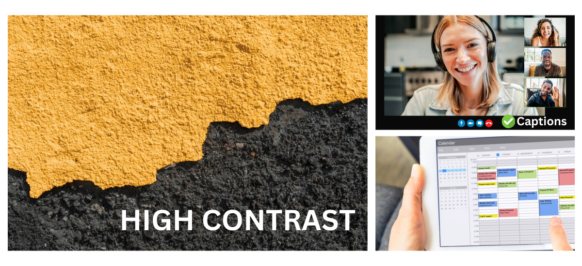
Brands will continue to put more emphasis on both accessibility and sustainability. This means designing graphics that are inclusive, while taking extra steps to make sure content is accessible to all, not just on new websites, but across all platforms and mediums of design. With businesses creating more sustainable practices, demonstrating that in their designs and how they create is the next step in reflecting a commitment to both people and the planet.
How to implement this into your next conference:
Accessible graphic design often builds on best graphic design practices, including:
- Using high contrast for text: avoid busy patterns or photos behind your text or create a masked effect behind text to help it stand out.
- Be mindful when using highly saturated colors since these can be uncomfortable for some viewers.
- Simplify layouts to be sure to maintain your visual hierarchy and reinforce what the most important information is.
Graphic Design Trends for a Brighter, Bolder 2025
Design trends in 2025 will be defined by adaptability, human connection, and innovation. As technology and cultural shifts shape the world around us, graphic designers will continue to create experiences that resonate on a deep, personal level while reflecting the evolving needs of society. By implementing some of these trends, based on what is most reflective of your organization, your audience will be drawn in and relate your brand with the current graphic design movement.
Want to read more about Association Management and design trends? Check out our other blog for more information: Design Trends for 2026: The UI/UX Shake-Up In Association Management
References:
NCS Colour. (2024, March 18). NCS colour trends 2025+ [Video]. YouTube. https://www.youtube.com/watch?v=example
Gartner, J. (2024, October 11). The 11 most popular web design trends for 2025. White Peak Digital. https://www.whitepeakdigital.com/blog/web-design-trends
Datum Creative Partners. (2024, September 3). Top graphic design trends to watch in 2025. https://datumcp.com/top-graphic-design-trends-to-watch-in-2025


